T
he year was 1914, and the newly established Madison Board of Commerce published a small volume to promote the industry and life of Madison, Wisconsin as a “remarkable place to live and do business.” It showcased praise from all walks of life and described a thriving city of intellect and industry endowed with great natural beauty.
One hundred years later and the words and stories still ring true today. Foundations which the community laid back then have had a noticeable effect on today’s business and community within the city. Inevitably, today the area sees a “density of talent, a diversity of industries, a growing number of startups and a high quality of life,” reassuring itself that it is seething with potential.
With this in mind, the Greater Madison Chamber of Commerce commissioned an updated version to be produced with the purpose of reflecting on the past 100 years of industry and commerce and also to set the stage, tone, challenges and advocacy of the business community for the next 100 years.

Since 1914, Madison has grown in size from 30,000 residents to now over 500,000. Many contributing factors play into that growth, including the stories of local community leaders, institutions, businesses and industries. It was with that in mind that we set out to research, inform, compare and contrast those that have stories dating back over 100 years and feature them in this reimagined version.
Businesses and industry feature prominently within and give both a historical context and current contrast as to how Madison’s business climate has taken shape over the past 100 years. Also compared to life 100 years ago, the community at large was highlighted in having played a significant role in defining and shaping the city of Madison today. It is interesting to read aloud from the original publication, sections of text that speak of things that today have impacted our lives greatly. Things like the Henry Vilas Zoo which was donated to the city in 1911, we still enjoy today. The philanthropy of the early 1900’s is still alive in Madison to this day, with many of the contributions like the Overture Center being highlighted as well within.
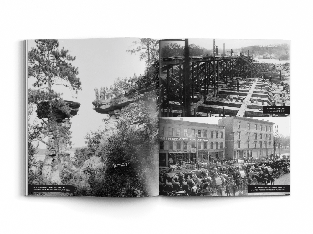
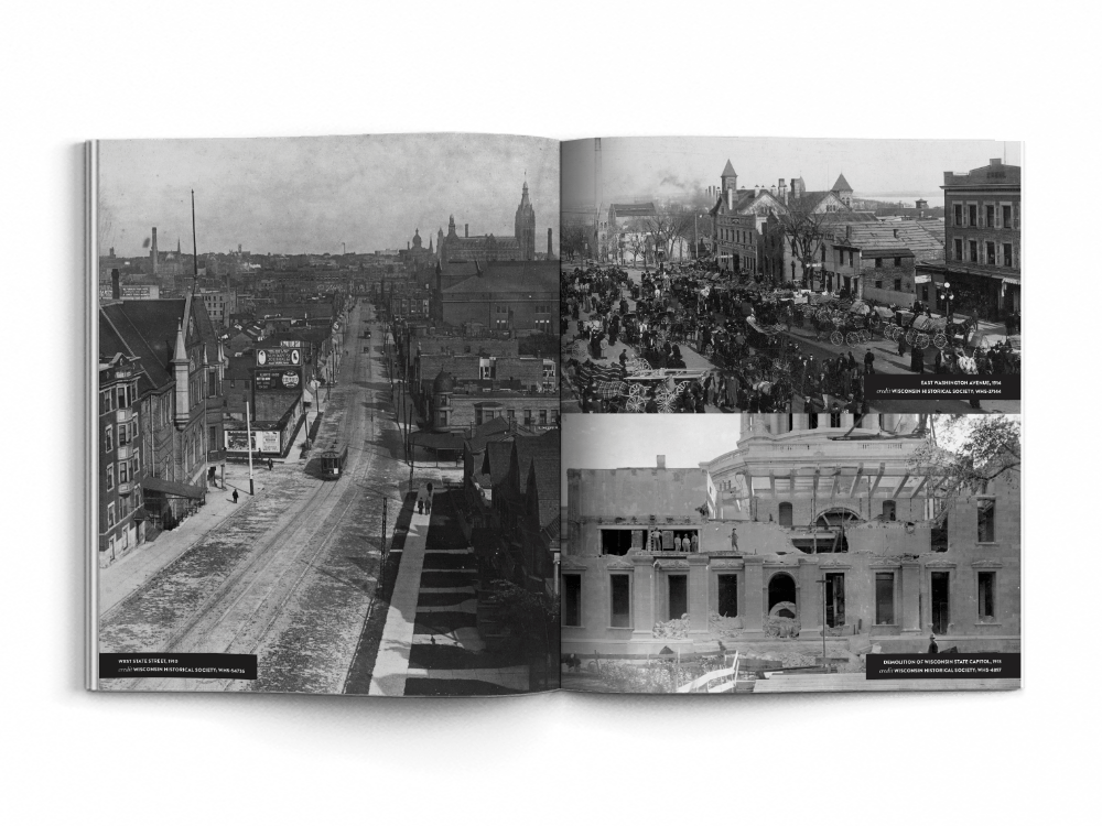
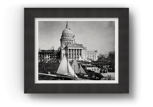
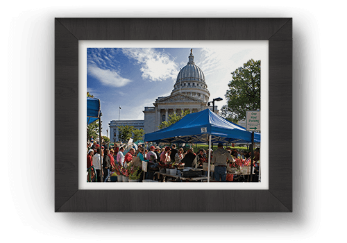
Apart from the extensive research that went into creating the narrative for this book, it was also equally important to collect images that helped support the overall theme. Of all the businesses that were featured, we were able to gather high resolution images of their current business and many were also able to provide us with images of their business from over 100 years ago. That was a key component to the contrasting nature and purpose behind publishing this work.
With that said, one can appreciate the idea that everything has changed, but nothing has changed and it’s our challenge today which will leave the legacy of tomorrow for future generations to come.
People who speak well of it today we expect will be able to say additional good things about it in the future. Otherwise it must become noted for having squandered its natural and human endowment.
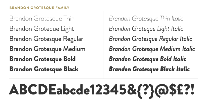
Brandon Grotesque an award winning sans serif type family of six weights plus matching italics. Befitting the historical aspect of this book, this font’s design was influenced by the geometric-style sans serif faces that were popular during the 1920s and 30s, just a few years after the book’s first publication. Brandon Grotesque is a well designed typeface for complex, professional typography. The font family has a functional look with a warm touch. The small x-height and the restrained forms lend it a distinctive elegance.
I specifically chose Brandon Grotesque’s heavier weights for their particularly great performance as a display font. This produces a great choice for eye-catching headlines and titles. Also greatly important, this typeface performs well at any size, reading and producing cleanly and at any size on the final printed page.
Janson is an old-style serif typeface inspired by a set of Dutch Baroque typefaces. It is a serif typeface originally designed by Miklós Kis, a Hungarian type designer from the late 17th century and available in eight weights. It is an even, regular design, particularly intended for body text. I wanted Janson specifically for the text solely for it’s legibility and that it was designed optimally for 12 point type. I was particularly drawn to it’s italicized text as I wanted something with a sense of dignity and elegance to help make any quotes “pop” off the page, and to flow against the body copy visually.

What I wanted to accomplish with the layout of this book, was to establish a grid that would be interesting and eye-catching, yet have a sense of flow from one page to the next. I didn’t want the viewer being bored by simply reading it as a literary work of non-fiction. I wanted them to be intrigued all the while being aware of a sense of high design and aesthetics being applied throughout. The details of the correlation between the elements that make up the grid were thought out to the smallest point of measurement, and equally the spatial relationships play a huge factor in the likability and warmness of this piece that make it endearing.

Using a well thought out grid that allowed for multiple layout formats proved beneficial, as each page flows from one to the next, making the content as interesting to look at as it is to read. The simple color palette of red and black text on white paper is both evocative and engaging the reader to read further on, while the images are either stunning reproductions of photographs a century old, or vibrant, beautiful shots from today of downtown Madison. Photographs of intrigue and vibrance jump off the page and capture not only the viewer’s eye, but their attention as well. One is drawn in to the page, making the act of reading the text, interesting and pleasing while not being overwhelming or fatiguing the viewer’s eyes.Outcome
Personally, I’m quite pleased with the outcome of this project and found it to be rewarding on multiple levels to have worked with others on it and produce. I invite you to take a look at it for yourself.